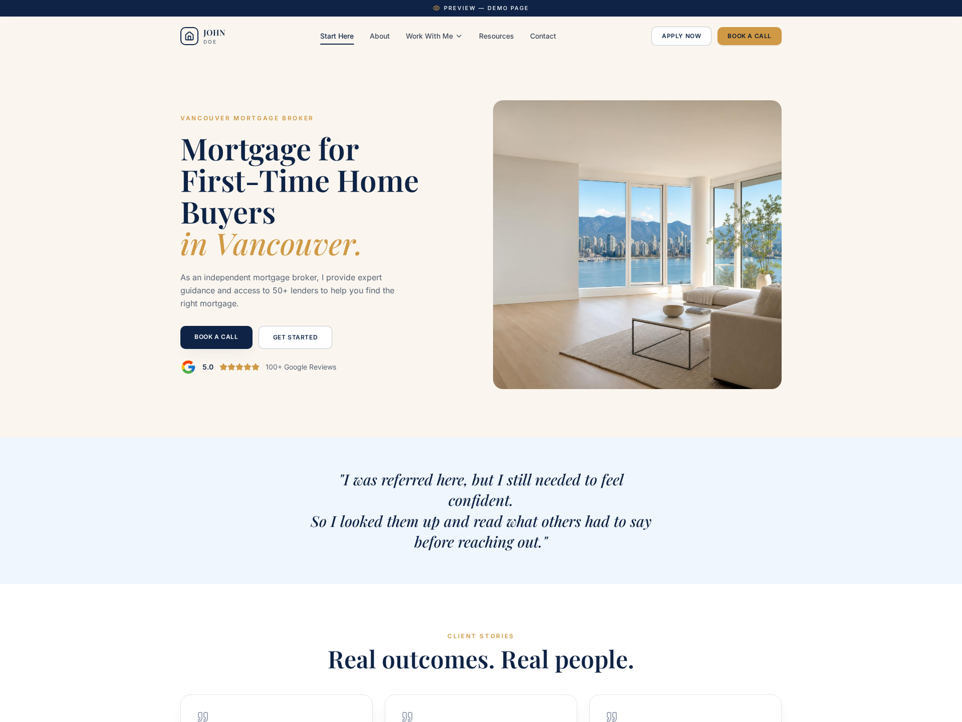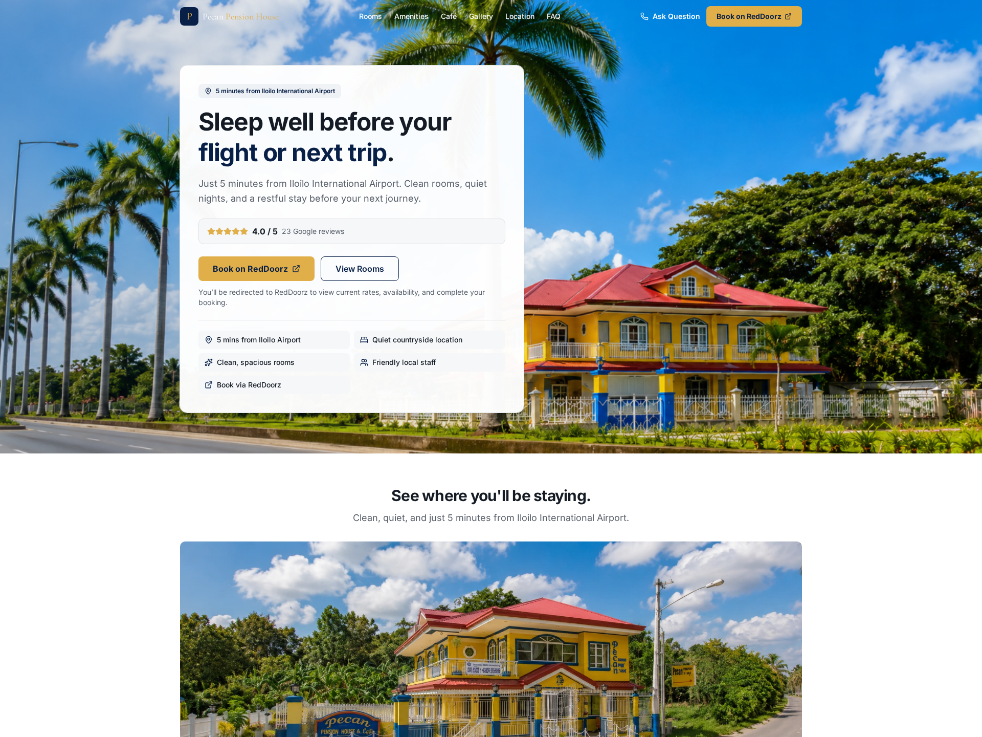
Before
Too many options made it difficult to begin.
People looking for pension guidance could encounter a large amount of information without knowing what applied to their circumstances.
Buyer
People looking for clarity, not more complexity.
The page needed to support visitors thinking about pensions and retirement who wanted personal, understandable guidance.
Problem
Complexity was creating hesitation.
When every detail feels equally important, it becomes harder for a visitor to recognize their situation and identify a useful first step.
Decision
Help visitors find themselves in the offer.
The experience needed to clarify what help was available, who it was for, and what continuing the conversation would involve.
Positioning
Personal pension guidance without the noise.
The offer is framed around calm explanation and practical direction rather than dense financial language.
Proof
Structure can create reassurance.
A clear explanation of the guidance and process reduces uncertainty and helps the visitor understand what happens next.
Action
Guide each visitor toward the right next step.
The page turns a broad financial topic into a manageable decision with a clear route forward.
After
A more confident way to move forward.
The finished experience helps visitors understand the offer, recognize its relevance, and continue without unnecessary friction.