Before
The same page, repeated across an industry.
Reviewing more than 25 mortgage websites showed a recurring pattern: broad claims, dense product information, and several competing actions on a single screen.
Buyer
First-time buyers comparing their options.
The concept was written for people early in the process, quietly comparing brokers and looking for someone who makes a large decision feel manageable.
Problem
Too much detail, not enough direction.
When every section carries equal weight, a visitor cannot tell which part applies to them or what a sensible first step would be.
Decision
Answer the questions asked before contact.
The page needed to establish who the broker helps, what working together looks like, and what happens after reaching out.
Positioning
Guided mortgage help, not product listings.
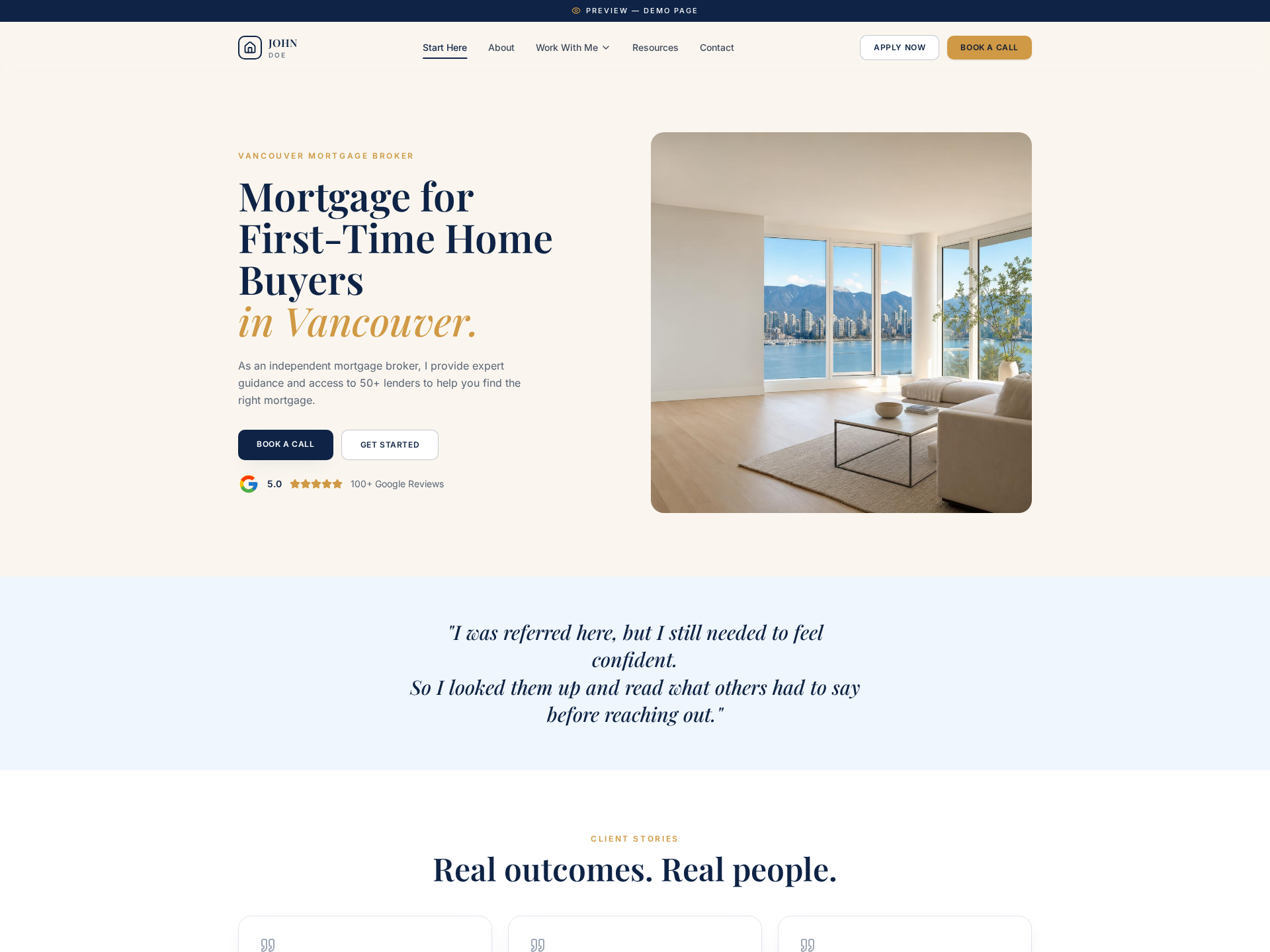
Rather than leading with rates and lender counts, the concept leads with the buyer's situation and the support available to them.
Proof
Credibility placed where hesitation happens.
Reviews, client stories, and a plainly explained process are positioned at the moments where a visitor typically pauses.
Action
One primary next step throughout.
Booking a call stays the consistent action, with an application path available for visitors who are already ready to proceed.
After
A concept that shows the thinking, not just the design.
As a case study, Pro1 Mortgage demonstrates how research into an industry can be translated into a clearer buyer journey.